Use hTWOo Core in your No-Framework SPFx web part
Install hTWOo UI
To add hTWOo to your project install the following package:
npm install --save-dev @n8d/htwoo-core
Now you are ready to add it to your web part.
Modify the manifest to enable theme variants
Edit your web part manifest and add the following code.
{
  //...
  "requiresCustomScript": false,
  "supportedHosts": ["SharePointWebPart"],
  "supportsThemeVariants": true,
  // ...
}
The property supportThemeVariants make sure that you can use any of the hTWOo components in colored SharePoint section.
Implement the Theme JSON to CSS variable conversion
Add references to SPFx ThemeProvider
To use different SharePoint themes add the following references to your web part code where the React components gets loaded.
import {
  ThemeProvider,
  ThemeChangedEventArgs,
  IReadonlyTheme,
  ISemanticColors
} from '@microsoft/sp-component-base';
Init an retrieve the Theme
To retrieve the current theme color slots add the following code in your web part base class.
  private _themeProvider: ThemeProvider;
  private _themeVariant: IReadonlyTheme | undefined;

  protected onInit(): Promise<void> {
    // Consume the new ThemeProvider service
    this._themeProvider = this.context.serviceScope.consume(ThemeProvider.serviceKey);

    // If it exists, get the theme variant
    this._themeVariant = this._themeProvider.tryGetTheme();

    // Assign theme slots
    if (this._themeVariant) {

      // output all theme theme variants
      console.log("LOG Theme variant:::", this._themeVariant);

      // transfer semanticColors into CSS variables
      this.setCSSVariables(this._themeVariant.semanticColors);

      // transfer fonts into CSS variables
      this.setCSSVariables(this._themeVariant.fonts);

      // transfer color palette into CSS variables
      this.setCSSVariables(this._themeVariant.palette);

      // transfer color palette into CSS variables
      this.setCSSVariables(this._themeVariant["effects"]);

    } else {

      // Fallback to core theme state options applicable for Single Canvas Apps and Microsoft Teams
      this.setCSSVariables(window["__themeState__"].theme)

    }

    // Register a handler to be notified if the theme variant changes
    this._themeProvider.themeChangedEvent.add(this, this._handleThemeChangedEvent);

    return super.onInit();
  }

  // Handle all theme changes
  private _handleThemeChangedEvent(args: ThemeChangedEventArgs): void {
    this._themeVariant = args.theme;
  }

  /// Converts JSON Theme Slots it CSS variables
  private setCSSVariables(theming: any) {

    // request all key defined in theming
    let themingKeys = Object.keys(theming);
    // if we have the key
    if (themingKeys !== null) {
      // loop over it
      themingKeys.forEach(key => {
        // add CSS variable to style property of the web part
        this.domElement.style.setProperty(`--${key}`, theming[key])

      });

    }

  }
This code will convert all theme available color to CSS variables.
Use hTWOo CSS
SharePoint frameworks use a tool named CSS Modules to give the web part styles a unique naming convention. To avoid bleeding out the hTWOo style to the rest of the page only one container class is needed.
Using the CSS Modules own definition all external style can be include in a fake pseudo class named :global.
Go to the web part and remove all it#s existing code and add a reference to hTWOo instead.This reduce the complete style sheet to the following code.
.hTwOoSample {

}
The hTWOoSample will still get replaces with a custom string like this.
.hTWOoSample_b629d693{
  /* this where the content goes */
}
First import the base elements from hTWOo core.
@use 'sass:meta';

@include meta.load-css('node_modules/@n8d/htwoo-core/lib/components/base');

.hTWOoSample{

}
From there you can use now all other comments in the main block of your web part using globals. The full list of features may look like this.
  // Imports all base mixin
  @use 'sass:meta'

  .hTWOoSample {

    :global {

      // For Accordions
      @include meta.load-css('node_modules/@n8d/htwoo-core/lib/components/accordion');

// For Avatar and Person selector components
      @include meta.load-css('node_modules/@n8d/htwoo-core/lib/components/avatar');

      // Various types of buttons
      @include meta.load-css('node_modules/@n8d/htwoo-core/lib/components/buttons');

      // Various types of cards
      @include meta.load-css('node_modules/@n8d/htwoo-core/lib/components/cards');

      // Various types of dialogs
      @include meta.load-css('node_modules/@n8d/htwoo-core/lib/components/dialogs');

      // Various types of forms
      @include meta.load-css('node_modules/@n8d/htwoo-core/lib/components/forms');

      // Various types of icons controls
      @include meta.load-css('node_modules/@n8d/htwoo-core/lib/components/icon');

      // Various types of menus controls
      @include meta.load-css('node_modules/@n8d/htwoo-core/lib/components/menus');

      // Various meta tags
      @include meta.load-css('node_modules/@n8d/htwoo-core/lib/components/meta-tags');

      // Various types of tables
      @include meta.load-css('node_modules/@n8d/htwoo-core/lib/components/table');

      // Various types of quicklinks
      @include meta.load-css('node_modules/@n8d/htwoo-core/lib/components/quicklinks');

      // Various types of typography
      @include meta.load-css('node_modules/@n8d/htwoo-core/lib/components/typography');

      // Various types of web part utilities
      @include meta.load-css('node_modules/@n8d/htwoo-core/lib/components/webparts');

    }
  }
Just include what you are actually using.
Use a simple button in your web part
In the render method of your file you can now add a simple button.
  public render(): void {
    this.domElement.innerHTML = `
      <div class="${styles.hTWOoSample}">
        <button class="hoo-button">
          <div class="hoo-button-label">My First H2O button</div>
        </button>
      </div>`;
  }
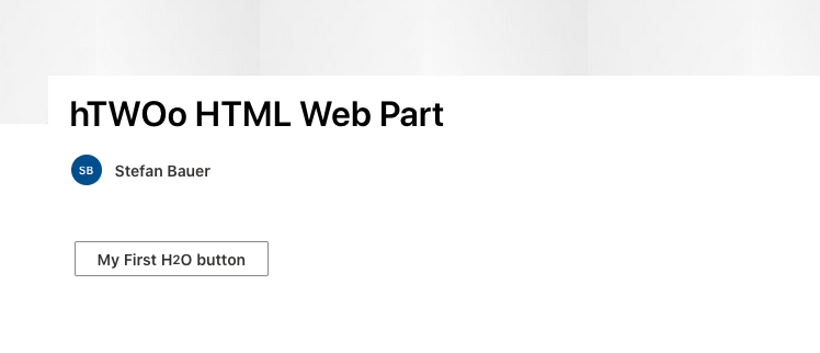
This should give you the following result in your browser.


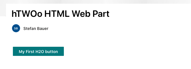
You can now add additional functionalities and other buttons to your code or just simply change it to a primary button by toggle only the style sheet class from .hoo-button to .hoo-primary.
A complete reference of all components can be found in the style guide.
HTWOO and theming
The way hTWOo handles theming and theme slots also allow you to change the theme without any extra effort and coding.
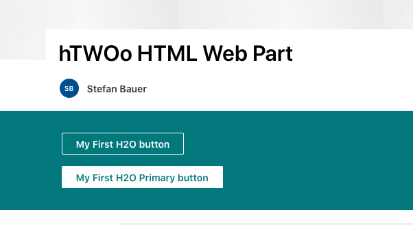
If you change the background to inverted for example, the colors will get automatically adjusted once the page has been saved.

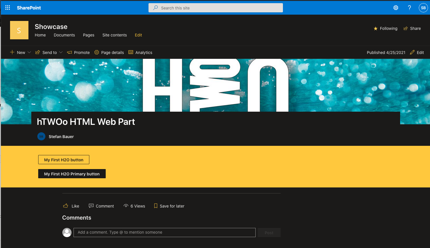
Or even an overall dark page theme work.

Download this getting started
You will find all sample in the hTWOo Sample.